
Guitar Hero exploded onto the video game scene in 2005, revolutionizing music games and popularizing the plastic guitar controller. More than just gameplay, the Guitar Hero Logo itself became an instantly recognizable symbol of rock music and gaming culture. Let’s dive into the visual history of this iconic logo and how it evolved alongside the game series.
The initial Guitar Hero logo, used from 2005 to 2009, captured the raw energy of rock and roll. Featuring a stylized, almost graffiti-like font, the words “Guitar Hero” were stacked with a dynamic, angled presentation. The logo often appeared in vibrant colors, embodying the high-energy gameplay experience. This era marked the rapid ascent of Guitar Hero, establishing it as a cultural phenomenon.
![]() Guitar Hero logo 2005-2009 PNG
Guitar Hero logo 2005-2009 PNG
The Guitar Hero logo underwent a significant redesign for the 2009-2015 period. This iteration adopted a more streamlined and modern aesthetic. The graffiti style was replaced with a cleaner, bolder typeface, giving it a more mature and contemporary feel. The stacked arrangement remained, but the overall design became more compact and impactful, reflecting the series’ continued evolution and broader appeal.
![]() Guitar Hero logo 2009-2015 PNG
Guitar Hero logo 2009-2015 PNG
For its final major release, Guitar Hero Live (2015-2017), the logo took another stylistic turn. This version opted for a futuristic and minimalist design. The words “Guitar Hero” were presented in a sleek, sans-serif font, abandoning the stacked format for a single horizontal line. This logo reflected the “Live” aspect of the new game, aiming for a more realistic and immersive experience.
![]() Guitar Hero logo 2015-2017 PNG
Guitar Hero logo 2015-2017 PNG
Beyond the main series logo, each Guitar Hero game often featured its own distinct logo, further enhancing its individual identity. For example, Guitar Hero II Logo maintained a similar font style to the original but incorporated unique visual elements to differentiate itself.
![]() Guitar Hero II Logo PNG
Guitar Hero II Logo PNG
Guitar Hero III: Legends of Rock Logo boldly declared its rock-legend status with fiery, energetic typography, perfectly capturing the game’s focus on iconic rock anthems.
![]() Guitar Hero III Legends of Rock Logo PNG
Guitar Hero III Legends of Rock Logo PNG
The game covers also played a crucial role in brand recognition. The Guitar Hero cover (PlayStation 2) for the original game established a visual language of energetic performance and rockstar aspiration.
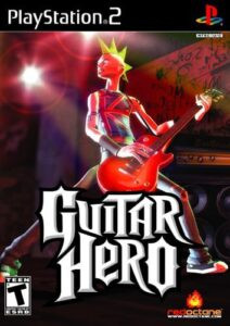 Guitar Hero cover (PlayStation 2)
Subsequent covers, like the Guitar Hero II cover (PlayStation 2), built upon this foundation, consistently featuring dynamic imagery and bold color palettes to convey the thrill of virtual guitar heroism.
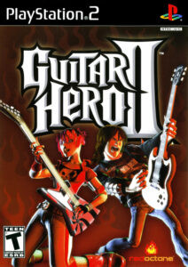 Guitar Hero II cover (PlayStation 2)
Even platform variations, such as the Guitar Hero II cover (Xbox 360), while maintaining core branding, offered slight visual tweaks to appeal to different audiences.
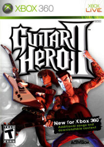 Guitar Hero II cover (Xbox 360)
The Guitar Hero III Legends of Rock cover (Xbox 360) cover further amplified the rock legend theme with more dramatic and detailed artwork.
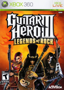 Guitar Hero III Legends of Rock cover (Xbox 360)
From the energetic beginnings to its modern iterations, the Guitar Hero logo has been a powerful visual representation of the series’ spirit. It mirrored the game’s evolution and solidified its place as a memorable icon in video game history and popular culture. While the series may be dormant, the Guitar Hero logo remains a nostalgic symbol for millions of fans worldwide.